Lifiniti
Evolving a Chinese brand around a French imaginary
Brand evolution
Lifiniti wanted to strengthen the perception of its French origins while maintaining continuity with the image already established among its Chinese customers.
CHALLENGE
As the core target audience is not Gen Z but women aged 45 to 60, it was important not to break too abruptly with the brand’s existing image.
Certain codes specific to the Chinese market also needed to be preserved, rather than developing a strictly French image. The target audience retains a fairly idealised image of Provence and expects to find some of these cues: naturalness, softness, flowers, light, refinement and an evocation of the South of France.
The challenge was therefore to find the right balance between French origins, Chinese cultural perception and Lifiniti’s own identity.
MY ROLE
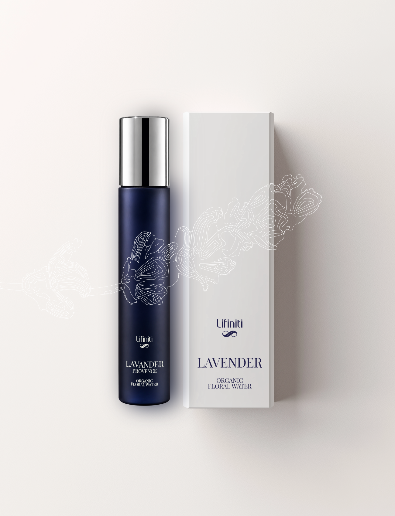
I designed a new visual identity and brand language that would allow the brand to evolve progressively rather than through a complete break.
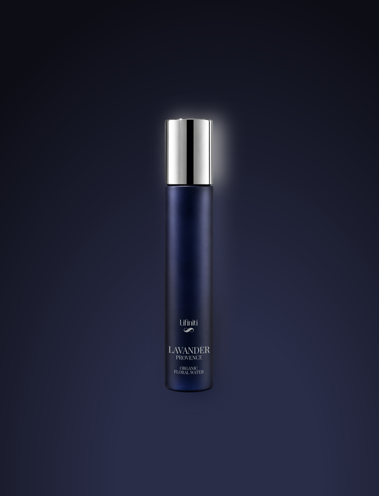
The logo, colour palette, typography, illustrations and art direction then formed the basis of a system designed to extend across packaging, communication content and the digital environment.
Over the years, this visual language has continued to evolve alongside the brand and the introduction of new ranges, while maintaining its underlying coherence.
RESULT
An identity that combines French codes with references familiar to the Chinese market, distinctive enough to be recognisable while retaining the flexibility needed to evolve over time.